
Dashboards for conservation: Connecting data to decisions
The conservation sector suffers from a stark disconnect between data and decision-making. Organisations pay a double cost: in the effort spent collecting information no one uses, and in the strategic choices made without the tailored evidence to back them. FOS designs and builds the conservation information systems and dashboards that close the gap.
The data trap
Many conservation professionals recognise the dilemma: A lot of effort goes into planning, coordinating, collecting, processing, storing, and sometimes visualising data – but much of the data never reaches the people making management decisions. At the same time, many decision-makers are lacking the data-grounded insights that help them make strategic choices.
Data sits scattered across shared drives, inboxes and single-user spreadsheets, hard to find and harder to trust. Reports get produced, filed, and never looked at again. The collected data is often unaligned with the questions the organisation needs to answer to track its impact or adjust its strategy. And in some cases, the monitoring effort itself delays the decision-making: action waits on evidence that no one has the time or tools to synthesise.
The alternative is straightforward: Start with the decisions your organisation needs to make and the questions those decisions depend on. Then, and only then, design the data collection and reporting to answer them.
| "An approximate answer to the right question is worth a great deal more than a precise answer to the wrong question." – John Tukey |
FOS helps partners move from data to functioning conservation information systems and dashboards that enable data-informed adaptive management. We do this by bringing our deep expertise in conservation strategy, management questions, and indicator design into the world of dashboards and information systems.
Making sense of conservation information
For many partners, a first step is to build a robust conservation information system: bring data from different sources – field monitoring, financial systems, spatial layers, external datasets, Miradi data – into a single interface that displays it all together. The value is both in the visualisation and in the shared foundation it creates: once the data lives in one place, the organisation can ask new questions of it as strategy evolves, without starting from scratch each time.
Global, publicly available datasets, like Global Nature Watch and the IUCN Red List, cover most of the planet in useful detail. What they cannot do is tell any one organisation what the data means for its own work. That translation – choosing the right lens, the right level of resolution, the right comparisons – is key to making the data actionable.
FOS Europe led the creation of a management information system and dashboard for the Madagascar Protected Areas and Biodiversity Fund (FAPBM), a trust fund that finances roughly half of Madagascar's protected areas. Public forest and biodiversity data are sliced and combined with FAPBM's own portfolio information, so the trust fund can see how its investments are performing compared to other areas.
| "For us, a dashboard is only useful if it helps us decide. Working with FOS, we built a tool that shows what is happening in the protected areas we fund – forests, wetlands, coral reefs, etc. – compared to other areas. It lets us measure the impact of our funding and adapt our strategy accordingly. We no longer just report on what we did, we see what it changes on the ground." – Mika Rasoamanana, MIS Officer, FAPBM |
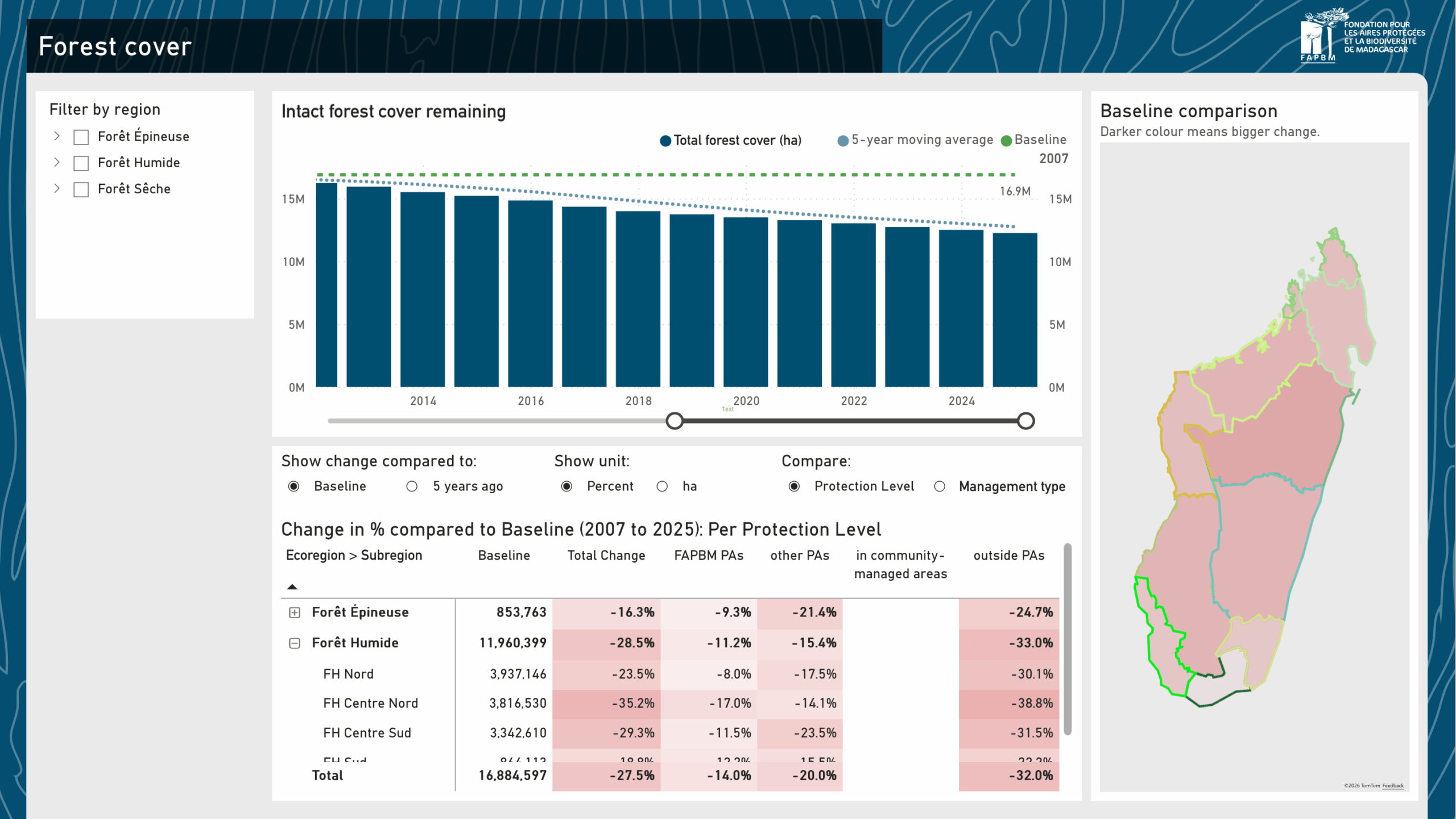
The forest cover view of FAPBM's MIS Dashboard.
Focusing on the core questions
In the end, a dashboard is only as useful as the questions it answers, and those questions are only as useful as the theory of change they interrogate. FOS helps partners build a clear theory of change, derive the strategic questions that follow, and only then design what to measure and how to show it. Without that grounding, dashboards end up visualising whatever data is available and easiest to plot, and management decisions stay disconnected from measurable information.
The Swedish Agency for Marine and Water Management (SwAM) is an example of this. Over three and a half years, FOS Europe worked with SwAM and more than 60 experts to develop a framework and method for designing and managing marine protected area networks, together with a dashboard to support adaptive management. Each view in the dashboard is firmly anchored in a management question related to the theory of change.
For example, to examine the “sufficient and effective protection across the MPA network” part of the theory of change, a question is “Is there enough protection of the right species and habitats?”. To answer that question, the visualisation shows the degree of protection relative to the protection objective of each focal value.
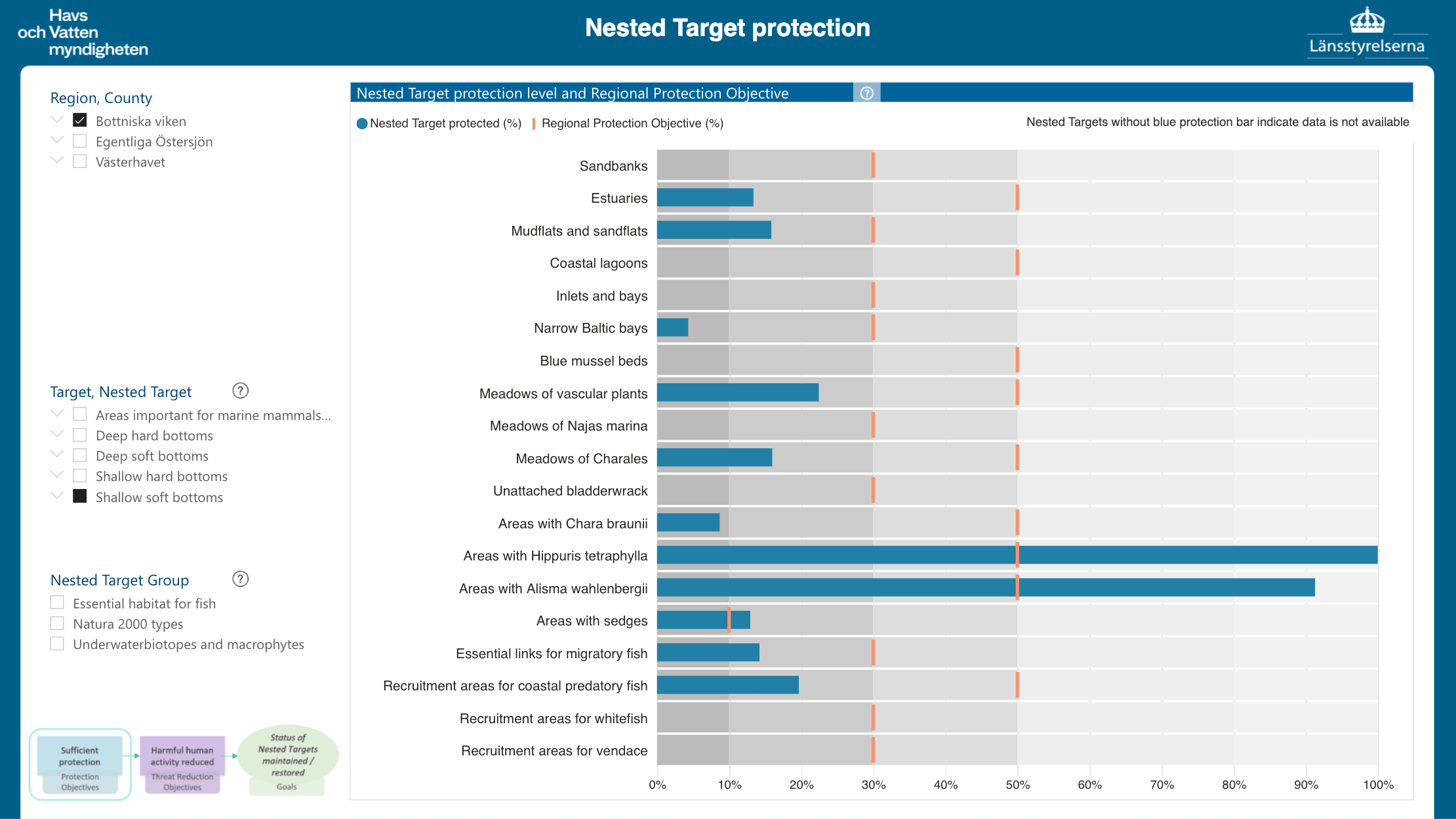
The protection view of the SwAM MPA networks dashboard.
The FAPBM and SwAM management information systems and dashboards were built in collaboration with Mike Honey and Annette Stewart, whose craft was central to shaping the tools.
Contact us
If you are thinking about how to turn your organisation's data into better conservation decisions – whether as a practitioner, funder or agency – we would be glad to talk! Contact us here.
Related topics
- On FOS's work with FAPBM: Strengthening the trust funds that sustain protected areas
- On FOS's work with SwAM: MPA Network Design and Management: the Swedish Framework and Guidance